
‘Recreational’ Mathematics
- NCase: Digital interactive projects. Highlights include Nicky’s To Build a Better Ballot (calculating distance, set theory); What Happens Next? (SIR-models, differential equations, exponential models); the Wisdom and/or Madness of the Crowd (flow of information across social networks); and Attractors (curves, dynamic systems).
- Timeline of Mathematics: The most notable mathematicians (and evidence of mathematics) since the Stone Age, presented in timeline form by Mathigon. Could be a useful starting point for students completing a research task into mathematicians, or as a way to introduce students to a new topic (e.g. Pythagorean Theorem). Also, consider checking out Mathigon’s Polypad tool – a workspace complete with various mathematical virtual manipulatives.
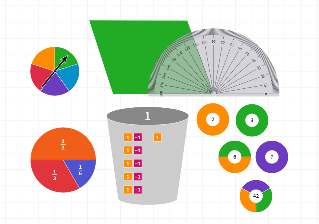
Featured (top left going clockwise): spinner, parallelogram and protractor, prime factor circles, bucket of zero, fraction circles
- Metaculus: An American-based website dedicated to gathering users predictions for various questions. Users gain or lose points depending on whether their predictions are accurate or not. The questions asked are often not limited to being answered in a short time period – for example, this question about human-machine intelligence parity will only be resolved by 2036 (quite a lot of the most recent questions are concerned with AI, space travel, politics, and COVID-19). Perhaps you could get your class to make and vote on long-term predictions at the beginning of the year.
- Recreational Mathematics: A directory to whole articles (or examples within other existing articles) of recreational mathematics, e.g. puzzles, games, and jokes. Not all of mathematics needs to have a practical use – although, if you are interested, consider browsing the rest of Wolfram MathWorld.
- Smart Voting Simulator: A very comprehensive and interactive guide to voting systems, based on the work of Nicky Case (NCase) and Paretoman. As a supplement, consider also watching CGP Grey’s videos on voting systems.
- Mike Bostock: Interactive applets and articles, mostly written for the New York Times. Highlights include Mapping the Spread of Drought Across the U.S.; Constellations of Directors and Their Stars; and Among the Oscar Contenders, a Host of Connections (opportunities for interpreting networks and charts).
- COVID-19 Articles: During the COVID-19 pandemic, many websites and media outlets (e.g. the ABC) produced interactive articles to make understanding the mathematical aspects of the pandemic easier. In addition to the ABC News vaccine article, consider also reading about how to ‘flatten the curve’ and the basic reproductive number R0, courtesy of the Washington Post, or about the mathematics of social distancing thanks to the Australian Academy of Science.
- Emoji Tracker: Aussie kids don’t seem to really use Twitter in large numbers – however, the emojitracker may be of at least some novelty to students? At the very least, perhaps you can inspire your students to make greater use of some of the least popular emojis on Twitter (as of writing, 🔣 has only been used 218862 times since 2013).
- 1 Pixel Wealth: A way to (practically) visualise wealth at different magnitudes. Tom Scott’s Road Trip video similarly demonstrates this, but in video form. Matt Korostoff has other serious webpages worth checking that use the power of the Internet webpage medium to convey and emphasise magnitude (Covid Vaccination in Real Time; 535,000 Faces; Incarceration in Real Numbers; 8m46s).
- The Oracle of Bacon: In line with the concept that we live in a small world where people can be connected within six degrees of separation, The Oracle of Bacon assigns a ‘Bacon Number’ to a given actor or actress. That is, the website uses its database to find how many connections (i.e. common movies) away an actor or actress is from the actor Kevin Bacon. Try experimenting with different pairs of actors or actresses, and also consider checking out the website’s inspiration – Erdos numbers.
- Post-Truth: An interactive applet that demonstrates a basic model for how disinformation can spread across a network of people (e.g. through social media networks like Facebook or Twitter; rumours across a school playground). You can alter the ‘consciousness’ parameter (bottom right) and observe the extent to which disinformation is able to spread in a mostly connected population.
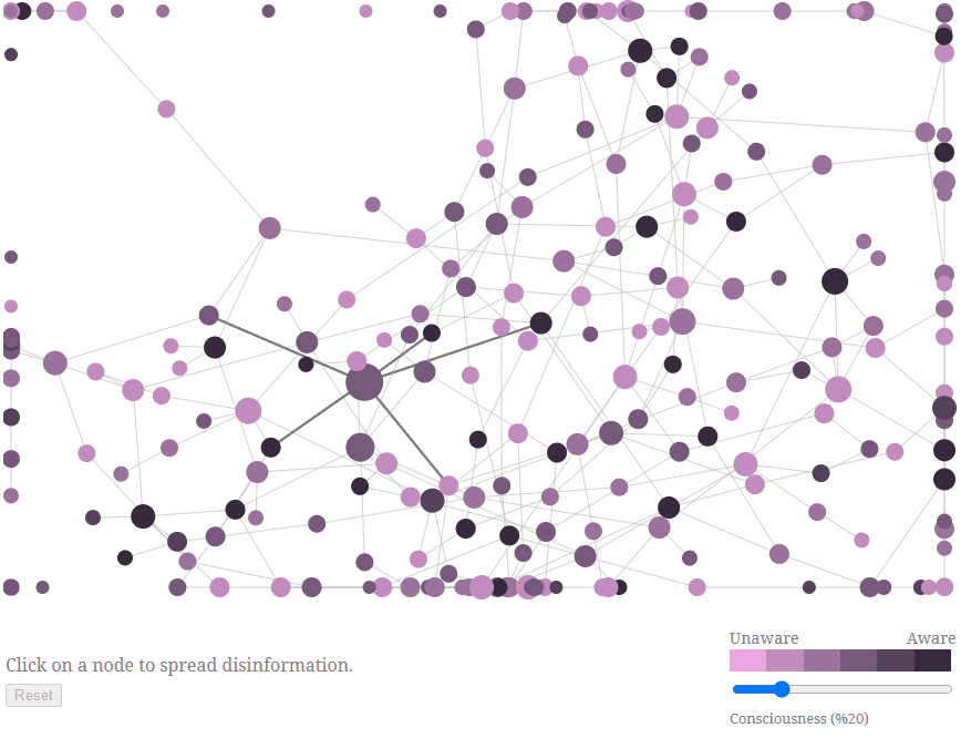
Observe that disinformation manages to spread throughout most of the network.
- Here is Today: An interactive website that places our existence into perspective by comparing the present time to different time scales, all the way to the age of the Universe. On top of learning (a tiny bit) about the history of the Earth and the Universe, students can also gain a visual intuition about different magnitudes of time.
- Rhythm of Food: Food trends visualised using Google Trends data over the last two decades. For more Google data, check out Google’s Books Ngram Viewer and Google Trends.
- 52 Factorial: A blog post describing the enormity of 52! (i.e. 52 x 51 x … x 3 x 2 x 1). Vsauce provides a visual version of the game outlined in the post. For more large numbers, consider reading this Wikipedia article, or watching Numberphile’s videos about big numbers.

- 220 Metro Maps: A visually pleasing collection of simplified maps of metro systems from across the world (albeit, possibly outdated). Could serve as a stimulus for a networks problem (e.g. design your own metro system). If your students are interested in metro systems, perhaps show them Mini Metro.
- Roman Roads Diagrams: Modern transit-style maps of the ancient Roman road network across different locations in Europe (including modern day Italy and Britain). A way to infuse a bit of history and geography into initial conversations about networks or travel-based problems.
- The Map of Mathematics: Poster of The Map of Mathematics, produced by Dominic of Domain of Science (see: video explaining the map here). If you have the time, you could try to print this out (or purchase a poster), and map each topic to the year or term in which students would be introduced to it, and display it in the classroom as a way to spark conversation.
- Google Arts and Culture: Virtual exhibitions and artworks – sometimes related to Mathematics and Science. Check out ‘8 Ways Mathematics Advanced the Arts‘, as well as ‘20 Years of Google Search‘, an ‘experiment’ which visually compares the trends of similar items in a category, e.g. animals, television shows.
- Monopoly Probability Distribution: Image that shows the probability of landing on any particular spot in a standard Monopoly game. Could be an interesting project for students to recreate (as a depth study for data collection and probability – perhaps consider other similar board games, or getting the students to make their own board game/dice). Consider also reading this article about probabilities in Monopoly.
Previous (First) Page: Teacher Blogs, Websites, and Videos
Next Page: ‘Interactive’ Mathematics
